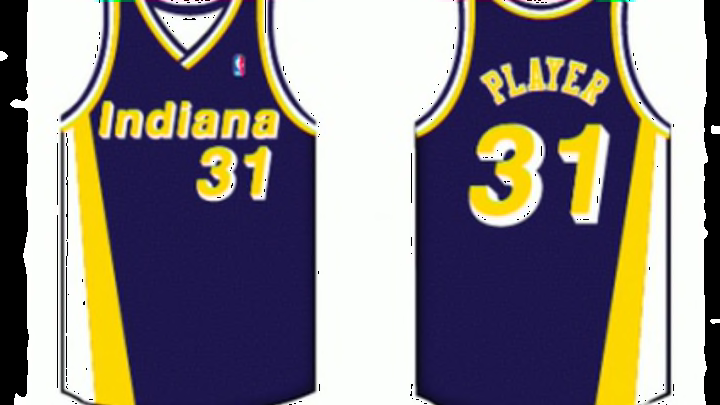
#2: 1991 to 1997
I was really conflicted between putting the “Flo-Jo” uniforms first or in the second spot. It was really close, and it pains me to put them as runners up.
So named for their creator — track star Florence Griffith-Joyner — I love the design of these uniforms. The sides really were amazing, and especially on the road versions, the yellow and white really gave the uniforms that “wow” factor.
Not only did they have this on the jersey, but the shorts had it as well and that was awesome.

The new logo was in great placement on the shorts, and you can see how much better everything began to look once the franchise embraced the darker blue. They haven’t deviated back to a lighter shade since launching the Flo Jos and its obvious why.
With a drop shadow style on the team name and numbers, the font does look dated now. But it was in fashion at the time, and while it probably wouldn’t fly today, that look does help place these in a specific era.
And, yes, it definitely helps that this was the era when the franchise first became relevant in the NBA before rising into one of the most successful teams since that point. Really, how can any Pacers fan not love the jerseys they were wearing when things like this happened?
It’s true: Without the Flo Jo era, this blog would have a different name.
Overall this was a sensational uniform, and I have nothing bad to say about it.
Next: Number 1
