


#3: 2006 to Present
These uniforms are flat-out cool — but for some reason many fans disagree.
The yellow, white, and silver stripe down the sides really makes the jersey. If you put this next to all the other NBA uniforms, it may not stand out immediately, but the stripes really keep it alive. And the way they taper up under the arms makes for a good look.
Especially when Paul George is doing stuff like this and showing off the uniform from all four sides.
Sure, PG could make a potato sack look good while throwing down a 360 windmill, but still. This one looks nice in motion.
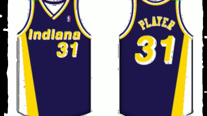
The “Pacers” on the home jersey and “Indiana” on the roadies also comes in a solid font that you don’t see too often. Same goes for the player names and especially the numbers.
The shorts do their job well, too, by continuing the side stripes and while also having either “Indiana” or “Pacers” on the rear end. I find that a bit odd but it’s whatever I guess and those who like to spend time looking there might enjoy them.
And putting the alternate logo on the sides of the shorts was a good choice. It really makes the shorts.
Piecing it all together, it isn’t a bad uniform. But since the Pacers M.O. has been mixing it up, it certainly is time for a change.
Next: Number 2