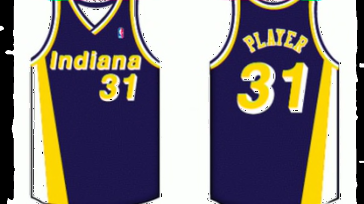
#4: 1977 to 1981
A lot of fans don’t even remember these jerseys. Then again why would you?
These were the original uniforms that the Pacers used when they got into the NBA, and the design team got a little too creative in areas that probably didn’t need it.
Most obviously, they used the team’s logo for the “P” in Pacers on the home jerseys, and it really ruined the design.
Otherwise, the font was slick. And while the number styling is the same football-looking design that the team had in all three of its first three uniforms, it still works since its a classic look.
You can tell just how much the logo in the P ruined things by looking at the road version.

That’s much better. A darker blue would have really made these look sweet, but even the lighter color that the team preferred then is a big improvement on the hokey home catastrophes.
The stripes that go from the jersey down to the shorts were sleek, too, and made this uniform much more creative than its predecessor.
But even with that, it is a little dull looking back on it from today’s perspective — even if it probably was a pretty cool uniform back in the day.
Next: Number 3
