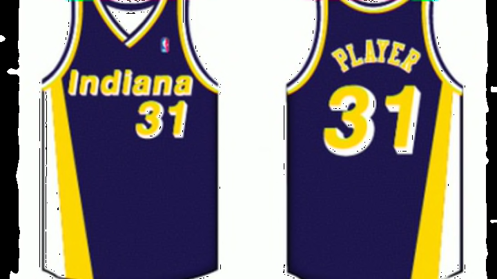
#5: 1985 to 1990
These uniforms look really odd. It seems like they tried to make them look futuristic in a Tron-like way, yet their old, ABA logo they had been using for many decades is still on them. And that makes them look like they are from two different eras — neither of which I would want to buy clothes in.
Ultimately, that’s what did them in: The old logo on the shorts really held these uniforms back.
The shade choice of the colors was odd too, if both the blue and the yellow was darker, it would’ve been a whole lot better. I like the jersey design, but different color shades would have been nice.
The shorts are very similar to the previous design, which is a bit bland. The logo placement is certainly an improvement, too, but overall the logo just shouldn’t be there. It really ruins it.
Additionally, these jerseys say “PACERS” on both the home and away jerseys. Usually, the team has had “PACERS” on the home uniforms and “INDIANA” on the road versions. That doesn’t necessarily make these any worse, but it does show the limitation of the design and that the style wasn’t adaptable.
Overall, these uniforms just seemed strange to me, and the different parts of the uniform didn’t fit together.
Next: Number 4
