

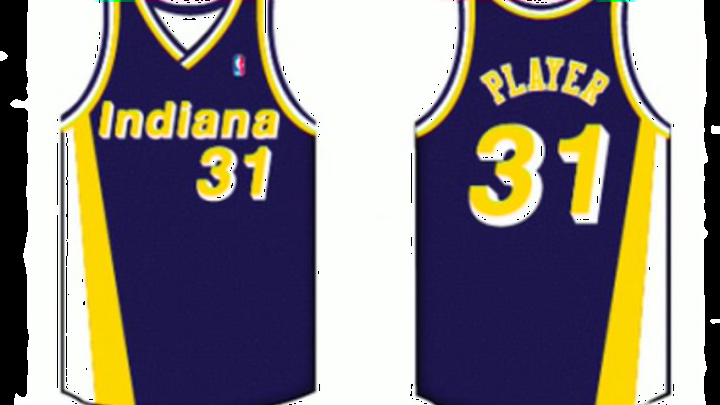

#6: 1981 to 1984
There’s a reason why these uniforms didn’t last very long: they’re awful.
Most junior varsity jerseys look creative by comparison, and even the team must have known they weren’t working. Because they were so bad that the Pacers even tried re-designing the home uniforms — going gold instead of white — two years after introducing them.
And it still didn’t work out, so they scraped the whole thing and went to a new design the following season.
The uniform has an ugly and bland jersey design and it’s fitting that the image here just says “Player,” since this looks like a cookie-cutter jersey fit for the an away team in Teen Wolf.
The jersey could have been saved if they used stripes on the side of the jersey, but instead it was just boring and plain.
The shorts weren’t better either. The only color was on the waist and the bottom lining. And the logo on the mid-thigh — who puts a logo in that spot? — didn’t make it any better either.
These were just awful uniforms, and the quick change was necessary.
(All images courtesy of SportsLogos.net)
Next: Number 5